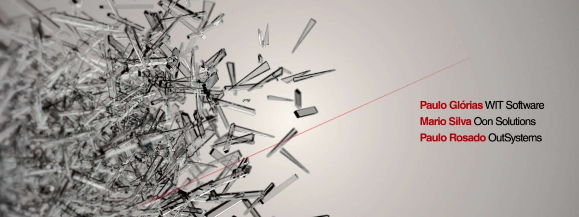
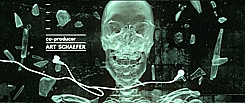
“Glass pieces and particles come slowly together to form the TEDxEdges title, the same way people and ideas come together at the TED talks,” says main title designer Filipe Carvalho about his opening titles for the 2009 Lisbon TED event.
What’s the concept behind the titles?
Filipe Carvalho: “Graphic design studio This is Pacifica came up with the concept for the print and online campaign, which was based on the idea of exploding glass pieces and glass lettering. Raul Arfwedson had done some 3D work for the posters, and we thought we could use that for the animation.
“We reversed the explosion, so the glass pieces and particles come slowly together to form the TEDxEdges title, the same way people and ideas come together at the TED talks.”
This is a 3D title sequence, but your heart lies with tabletop shoots, and working with real objects and sets. How does that compute?
“I’m very influenced by film and photo-journalism. The tension and almost physical feel that you get from those kinds of images –especially war photography– is very appealing to me. This led me to become ever more attracted to live action projects and to develop a distinct style, filled with texture and kinetic camera movement.
“In my projects, I usually prefer to use those shots that weren’t correctly framed or shots that jump around. They always look much more alive and human, they bring an emotional weight that is very difficult to convey if you’re trying to mimic it in post-production.”
What interests you about designing main titles?
“Well, Kyle Cooper said it right, of course. It’s about creating a bond with the viewer, make him curious enough to not want to leave his seat. Unlike commercials or interactive systems, everything I do has to help build a mood, a feeling, which ties in naturally with the film’s subject and ultimately makes it better.
“It’s a rush that I don’t get with anything else.”
But an event is much more abstract than a movie. What’s the biggest difference for you as a designer?
“Titles for an event are usually there to serve as an introduction of the speakers and the event’s subject matter. In a way, there’s more freedom to create a mood from scratch, because there’s no underlying narrative that you have to take into account. This allows me to work in a more abstract and graphic way, as is the case with the TEDx titles.”
What designers inspire you?
“I really admire the body of work of Danny Yount from Prologue. He’s been incredibly consistent, and has some of the best work around. Also Eric S. Anderson and Matt Mulder of Digital Kitchen for revitalising TV titles with their brilliant work for Dexter (watch at Art of the Title), House, True Blood and Rescue Me.
“I follow Paula Scher‘s work, as well as Michael Bierut‘s. Their graphic concepts and execution are wonderfully inspiring.
“And then there’s film directors Michael Mann, Tony Gilroy, Paul Greengrass. I’ve probably seen Mann’s ‘The Insider‘ a hundred times. More inspiration per-frame than any other film.
“And recently, I was very impressed with Tak Fujimoto‘s cinematography in ‘John Adams‘.
“Interestingly, I find working with people from outside the field of design and film very inspiring. They tend to look at things in a disconcertingly simple way, and more often than not, totally out-of-the-box. I find that very refreshing.”
Interview: Remco Vlaanderen
Year of production
2009
About Filipe Carvalho
Filipe Carvalho is a freelance designer and director for film and tv. He lives and works in Lisbon, Portugal. He was web designer and graphic designer for seven years, but moved on to motion design, because he got frustrated with the limitations of web and print. “There I was able to stretch my legs in graphic concepts, narrative and filmmaking,” Carvalho says.
Full credits
Design and Animation
Filipe Carvalho
Design/Animation/Art Direction
This is Pacifica
3D
Raul Arfwedson
Music
edIT “Twenty Minutes”



great piece of work,
*5
with the motivational interview,
amazing was this done with 3D software or just AE
Thank you everyone for your comments.
This was done on Cinema 4D with Maxwell Render. The editing and colour correction were done in After Effects.
This is a 3D title sequence, but your heart lies with tabletop shoots, and working with real objects and sets. How does that compute?
“I’m very influenced by film and photo-journalism. The tension and almost physical feel that you get from those kinds of images –especially war photography– is very appealing to me. This led me to become ever more attracted to live action projects and to develop a distinct style, filled with texture and kinetic camera movement.