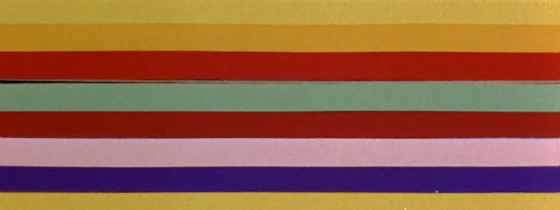
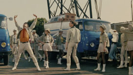
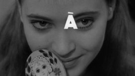
One of France’s most well-known title designers Jean Fouchet created a highly innovative animated title sequence using strips of colored paper offset with dynamic typography for L’Homme de Rio (That Man From Rio).
.jpg)
That Man From Rio, stills
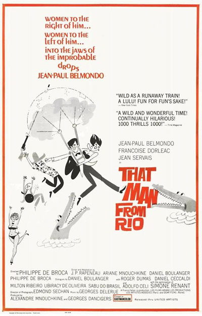
That Man from Rio is a Franco-Italian film directed by Philippe De Broca. Private Adrian Dufourquet arrives in Paris for a week-long leave during his military service. He tracks down his girlfriend Agnes, but she is kidnapped before his very eyes. At the same time, an anthropologist colleague of his father’s mysteriously disappears. Adrien sets off in pursuit of the kidnappers. He finds himself in Rio de Janeiro, Brazil, on the trail of stolen Indian statues.
De Broca started his career as a military press service operator during the Algerian War. During this time he was witness to tortures that utterly reviled him, and decided to turn to directing – creating movies that evoke life through fantasy. In That Man from Rio, the writers draw heavily on the adventures of Hergé’s famous cartoon character, Tintin. This comedy of adventures sees its anti-hero struggle with multiple means of transport to traverse landscapes and overcome challenges. It is a highly entertaining movie, and became a classic that would kickstart the success of Jean-Paul Belmondo. Steven Spielberg even used it as inspiration for his Indiana Jones saga.
01.jpg)
The film’s credits were directed by Jean Fouchet, one of France’s most well-known title sequence directors. He created a highly innovative animated sequence using strips of colored paper. These refer to a scene which appears towards the end of the film, in which Jean-Paul Belmondo finds himself in a bar run by Lola, a singer, and where the doors and windows are draped with multi-colored curtains. In this gleefully-shot scene, our hero finds himself amid a jubilant brawl. By referring to this, one of the story’s final scenes, Jean Fouchet brings the film full circle.
The font is reminiscent of the work of Roger Excoffon, a major figure of French typography who worked for the Olive Foundry. After the war he completely revolutionized French typography, creating the Banco and Mistral typefaces, which became classics in French print. The writing is characterized by a coarse, dynamic style that was popularized at the time. The letters appear as free characters and seem to dance across the screen, offsetting the composition and rigorous animation of the horizontal strips, which gain lightness in these irregularities.
The whole sequence is paced against a batacuda piece by Georges Delerue, De Broca‘s favorite composer. Originating in Rio de Janeiro, batucada is a sub-genre of samba which utilizes traditional percussion instruments. The intense beat suggests a fast-paced film in which neither protagonist nor viewer will get bored…
Text: Laure Chapalain, © SubmarineChannel 2011
Year of production
1964
About Jean Fouchet
Jean Fouchet was born in France in 1918. He graduated in graphic arts and began working in the film industry as a set designer, decorator, assistant operator. In 1950 he was hired by the Lax company to handle special effects and credits. Shortly thereafter, he founded his own company, F.L. He started creating title sequences, trailers and special effects. Among others, he made the special effects for the film The Longest Day in 1962. The last film he worked on was The Tenant by Roman Polanski in 1976.
Full credits
Title Designer
Jean Fouchet
Music
Georges Delerue

