MAGIC TITLES
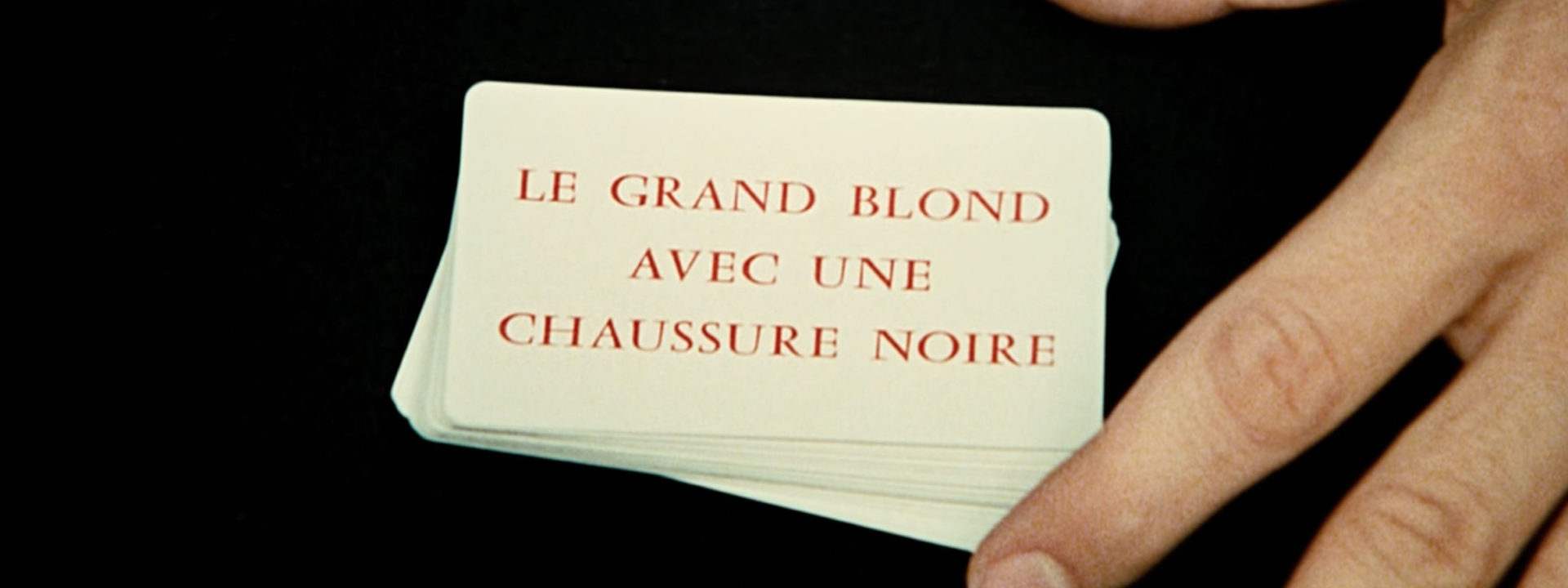
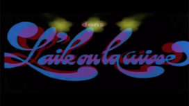
No CG (this is 1972, after all), or any other form of film processing was used to create the title sequence for The Tall Blond Man with One Black Shoe. It’s just magic and a deck of cards. The illusionist’s hands performing the card tricks are Gérard Majax‘s. Majax, who is like the French David Copperfield, was, and still is a TV star in his home country. This is his first and only title sequence.
.jpg)
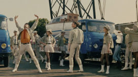
Le Grand Blond Avec Une Chaussure Noire (original title) is a 1972 French comedy directed by Yves Robert. The head of the French secret service, Louis Toulouse, discovers that his deputy is scheming to double-cross him. Toulouse decides to frame his deputy instead. He uses an outsider, François Perrin – an absent-minded violinist – as a decoy by making him pose as a secret agent who has to settle the affair. Gullible, Milan then sets up a team of spies to spy on Perrin…
Yves Robert started his carreer working as a typesetter in a print house. Not a surprise, considering his interest in title design. The idea for the title sequence for The Tall Blond Man with One Black Shoe emerged after Robert attend a performance by the famous magician Gérard Majax. Majax had dinner with Robert after performance. The director – who was very excited about the show – proposed to Majax to design the title sequence for his new film. Majax accepted under the condition that the entire sequence would consist of unique and original tricks.
A deck of cards with the names of the film crew was printed. Thus the art of magic and cinema merged, confronting the viewer with himself. Just like the character of Milan, who wants to believe that Perrin was a spy because he was told to, we believe what is unfolding before our very eyes thanks to the power of images and narrative. We want to be deceived.
A funny little anecdote. Due to its success in France, the film was also released in the US, so the credits had to be translated to English. Majax‘ original title sequence was replaced by ordinary title boards. However, Majax was still credited as the creator of the title sequence. Those who noticed were surprised to find that the famous magician had tried the art of designing title cards!
The music by Vladimir Cosma will resonate forever in our minds. The success of this piece is due to the fact Cosma doesn’t confine himself to simply creating a parody of spy movie music, as is often the case. He adds a dramatic side to it. He draws on the music of his home country, Romania, by using two instruments – the panpipes and the cembalo – which were very little known, if at all, to French audiences. Thus, the music adds color to the film. It is not your average comedy movie music. Francis Veber, the screen writer, said it sounded like a “gypsy dance of death.”
Text: Laure Chapalain, © Submarine Channel 2011
Year of production
1972
About Gerard Majax
Gérard Majax is a very famous French magician, born in 1943. At 18 years old, during his studies, he made a living by performing magic shows in several famous cabaret groups. Majax goes on a world tour with the Olympia Music Hall. Back in France, he frequently does guest appearances in television shows, which helps him consolidate his success. Majax’s passion for optical illusions gave him the idea in 2000 to create the “Hallucinoscope” – a virtual reality system without electronics that gives the user the impression of crossing the border of reality or going in levitation. Museums and amusement parks all over the world used his inventions. The “Futuroscope” for example, allowed visitors to step into a giant Moebius comic book. But the contact with the audience is very important to the magician. Majax continues to work on stage shows to this day.
Full credits
Title designer
Gérard Majax
Music
Vladimir Cosma
Director (movie)
Yves Robert


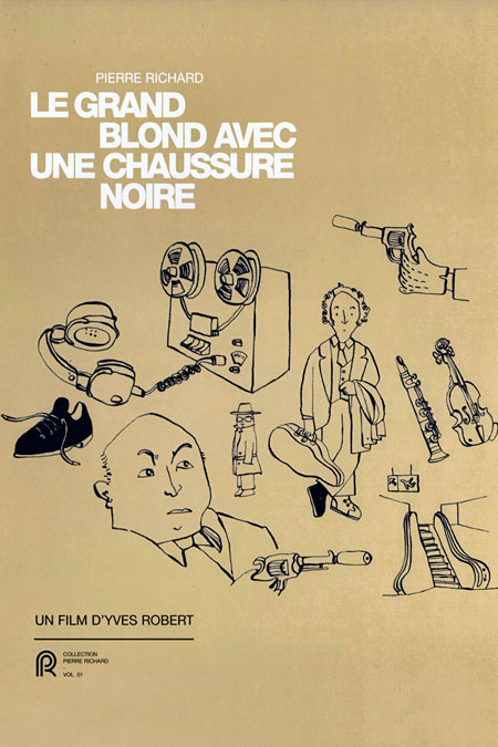
very clever and fun sequence. i also love the poster design & illustrations: they also tie in to this fun-yet-dramatic atmosphere. good stuff!
@Liselotte: this is just one of the movie posters that were used to promote this film. But I liked this one best. The art of Movie poster design seems to be almost complete lost nowadays. Movie posters are so boring now.