How to Create Your Own Little World. The Making Of the Main Titles for OFFF Barcelona 2013 by From Form.
The fuss about the Main Titles for OFFF’s annual flagship event in Barcelona might seem like a bit of a hype. But at least it’s a substantiated hype. It’s a daunting challenge for any title designer to live up to the expectation. Especially for a newcomer to the scene, like Dutch studio From Form. But these guys delivered. From Form created a beautiful short live action film about a Victorian collector with 46 titles embedded in the scenes.
Recap!
This article is based on From Form’s presentation at OFFF. The breakdown of their process was both disarmingly entertaining and highly informative.
July 7, 2013, in sun-drenched Barcelona
It’s the third and last day of the OFFF Festival at the Design Museum. The Main Room seats -I’m guessing- 2,000 to 2,500 creative boys and girls from all over the world, mostly designers and illustrators. From Form premieres their main title for OFFF to a hungry crowd. I could almost taste the anticipation in the air.
From Form
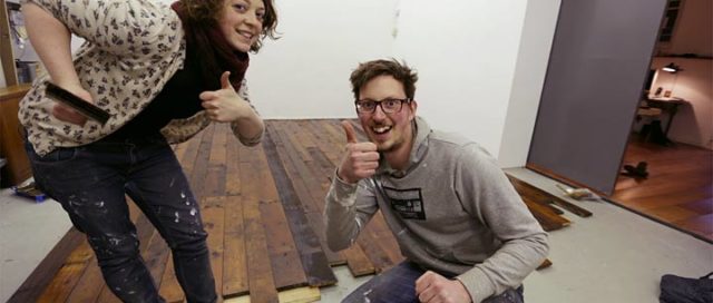
From Form is a design studio based in Rotterdam, The Netherlands, founded 2012 by Jurjen Versteeg and Ashley Govers. The studio focuses on (the combination of) film, motion graphics and title design. Projects often combine analogue and digital techniques. Jurjen Versteeg studied Interactive Multimedia and Audiovisual Design at the Willem de Kooning Academy in Rotterdam, The Netherlands. Versteeg met fellow student Ashley Govers, who studied Interior Architecture at the same school. Here they are, posing in their studio’s workshop in what will eventually be the set of the OFFF 2013 Main Titles.
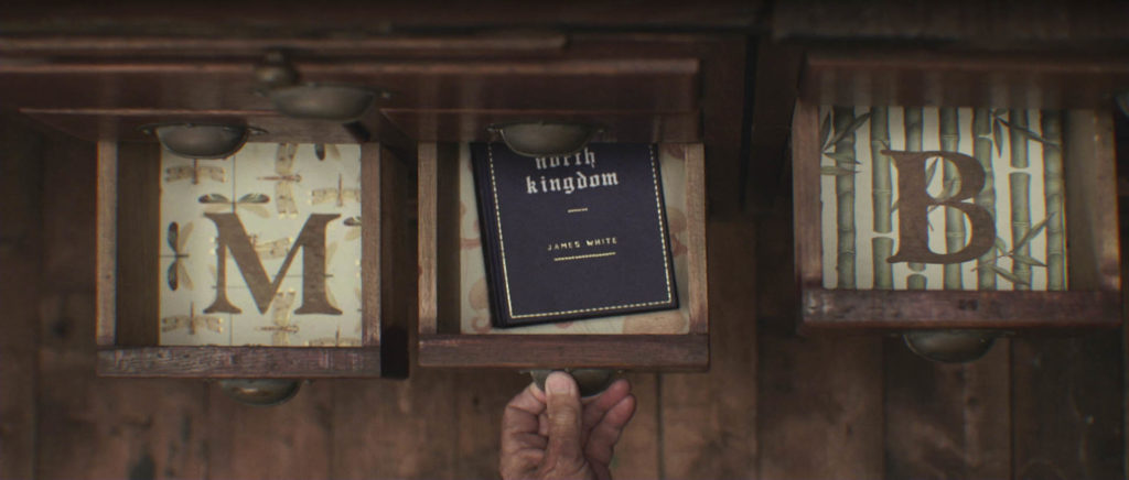
ONE email…
…to Héctor Ayuso, OFFF’s end boss, is what kicked things off for From Form – a then only one year-and-a-couple-of-months-old studio based in Rotterdam founded by Vimeo Award-winning motion designer Jurjen Versteeg (A History Of The Title Sequence) and interior architect Ashley Govers. Like any young design firm, From Form had goals and ambitions. Theirs were clear; work hard, deliver excellent stuff, and then, maybe in 5 years time, present their work at OFFF.
Anything we can do for the upcoming conference?
Sure! replied Héctor, almost instantly.
One email. Next thing you know, Ash and Jur were designing 14 bumpers for Saturday’s program. ManvsMachine were working on the Main Titles, but they had to cancel. From Form stepped in and offered to do the job.
Watching Ashley and Jurjen share their story up there on the OFFF stage, it was like they were still not quite fathoming it. To do the OFFF titles that early in a design career is like the designer’s equivalent of an upcoming singer who gets asked to perform at the Super Bowl.
From the initial 14 bumpers, they now had to create a title sequence for all 46 guests. With only two months left to go, From Form realized they needed to shift gears now. Designer Wouter Keijzer joined the project.
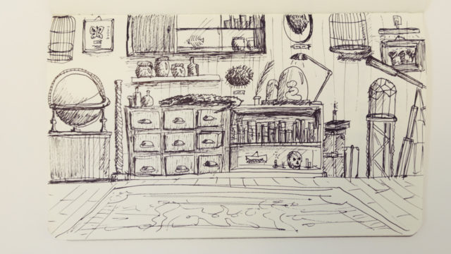
During their research, From Form came across various ‘Cabinets of Curiosities,’ which were used to display collections of unassorted but interesting objects before museums took over that role. Main purpose of these cabinets was to imbue visitors with a romantic sense of wonder, awe and amazement.
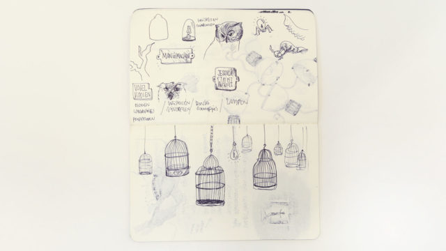
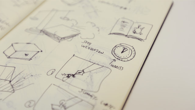
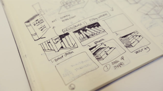
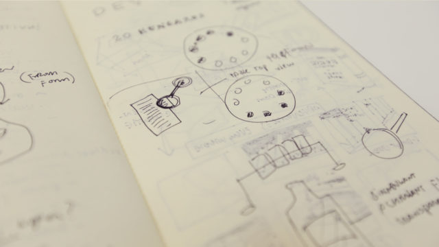
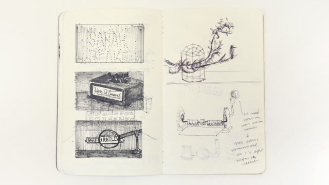
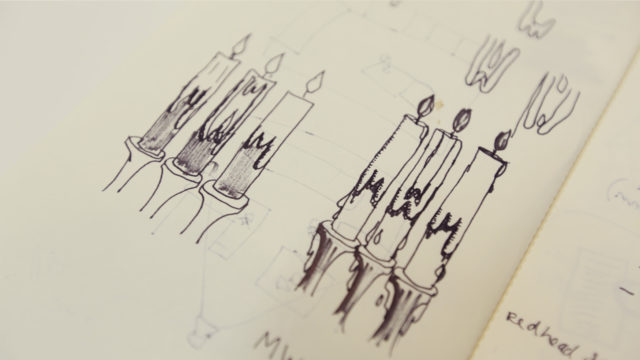
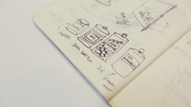
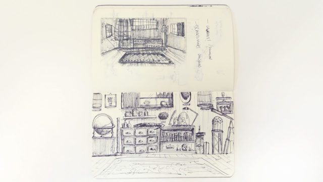
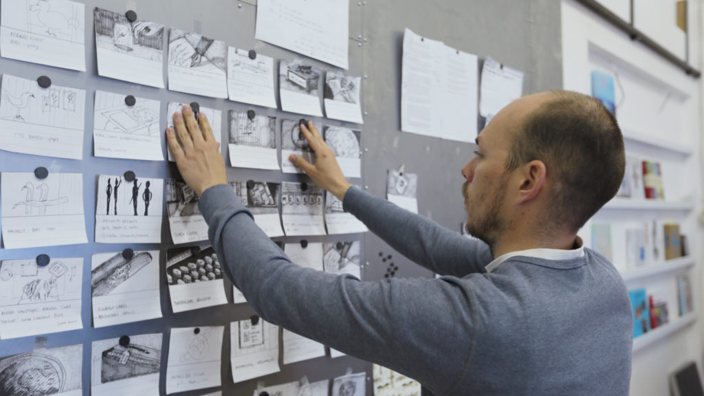
“Sketching was an important step in the production process and helped us get a better idea of what things should look like.”
INspiration
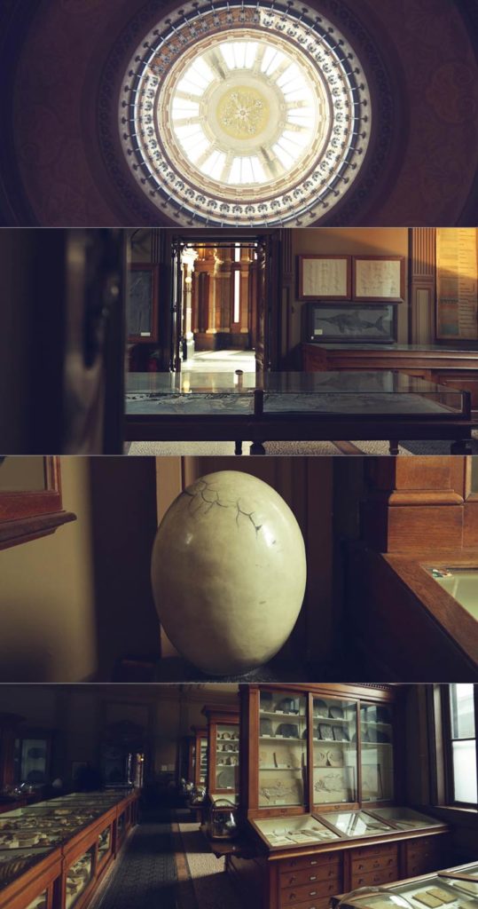
THE STORY
Wouter Keijzer, who wrote an 8-page story about a Victorian collector, explains how they wanted to emphasize the resemblence between the creators of today and the explorers of that era. “Explorers in their time discovered and charted the world. The people in this audience are rediscovering the world, looking at the world we live in, and recreating it. This is why we put a big emphasis on imagination.”
Time To Make It!
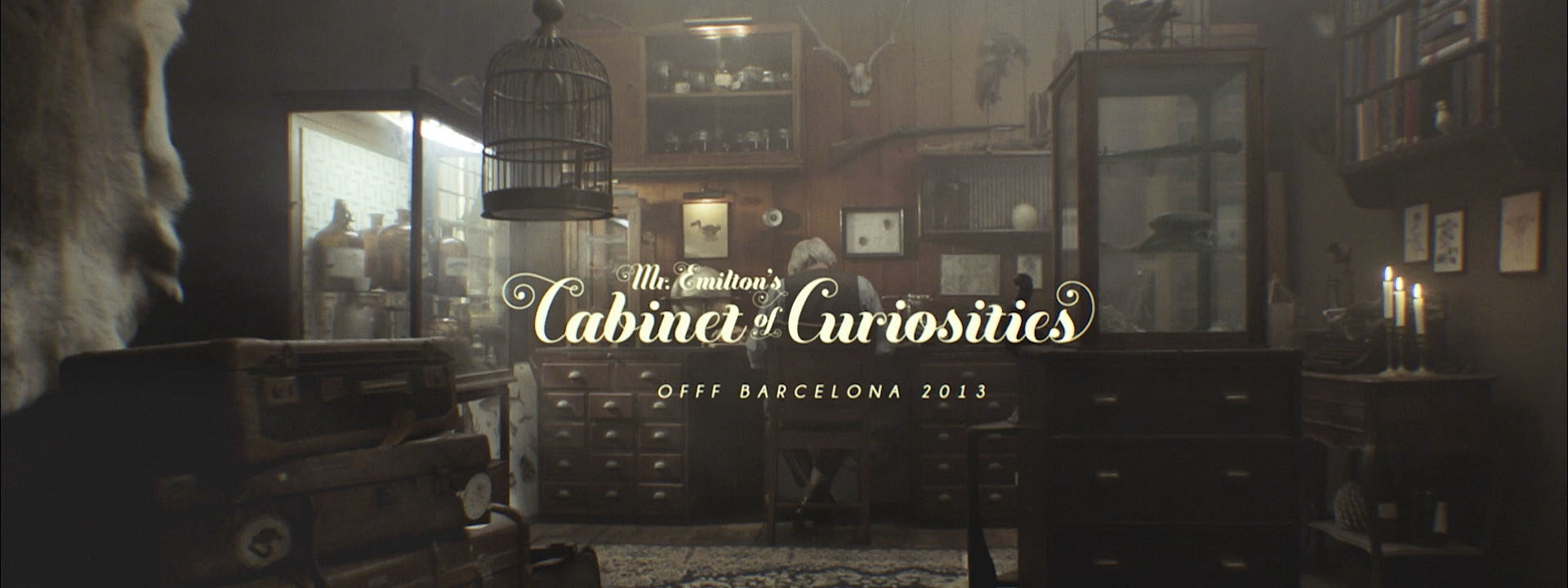
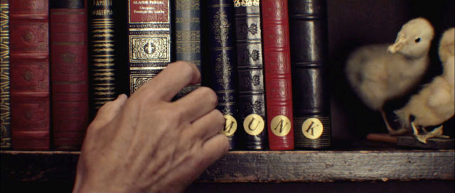
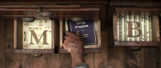
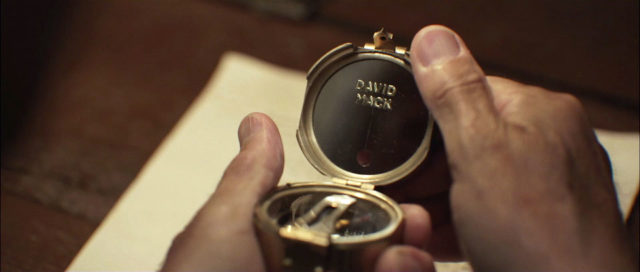
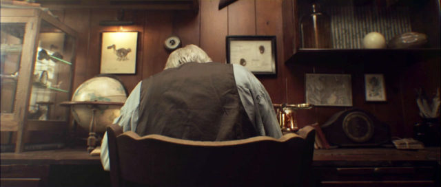
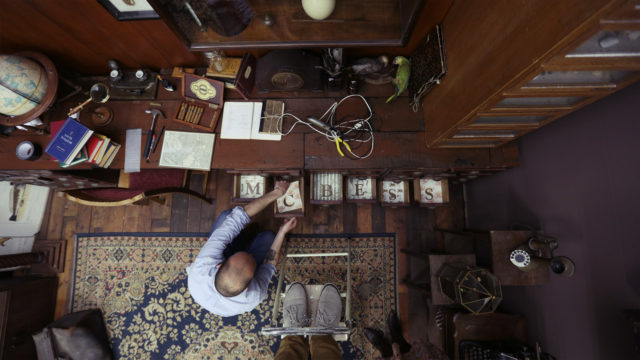
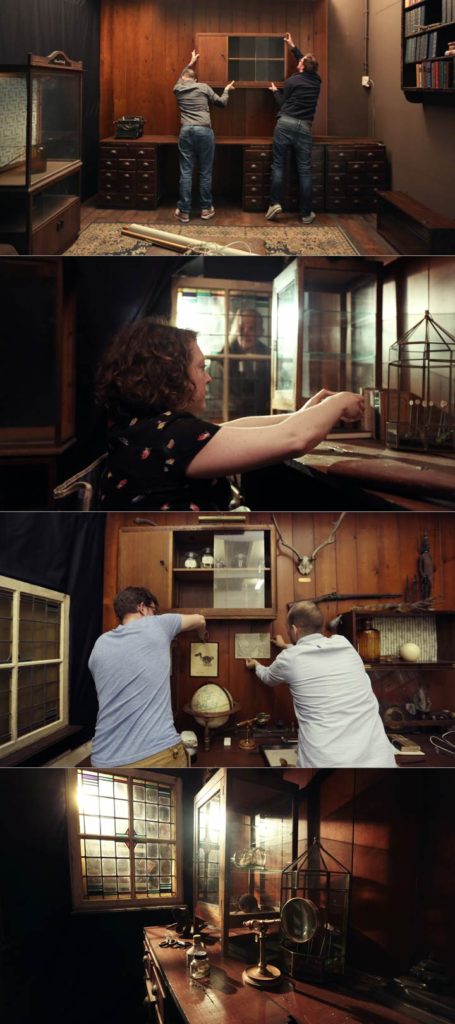
Filming at the monumental Teyler’s Museum was not an option, so From Form’s workshop was painstakingly converted into a 19th century Cabinet of Curiosity.
COLLECTING THE INTERIOR
Jurjen: “Where do you find a 19th Century room? And for free?”
Wouter: “At my parent’s house!”
The crowd laughs. But Wouter is not kidding and wows the crowd with snapshots of his parents place in the countryside, where they’ve got “barns filled with creepy stuff.” This is Harry Potter’s set designer’s wet dream. Wouter, Jurjen and Ashly loaded up everything they liked into their old van. Antique furniture, amazing display cabinets, Victorian-style leather suitcases…
“The main character was collecting his whole life, so we needed a lot of stuff,” explains Jurjen.
Next up: the hunt for props.
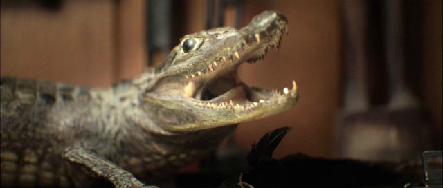
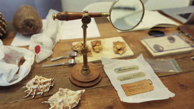
Marktplaats, a Dutch advertising site similar to Craigslist, proved the perfect place to find lots of “little stuff,” like ink jars, and notebooks, old books, lamps, glass jars, stuffed snakes and crocs, and globes.
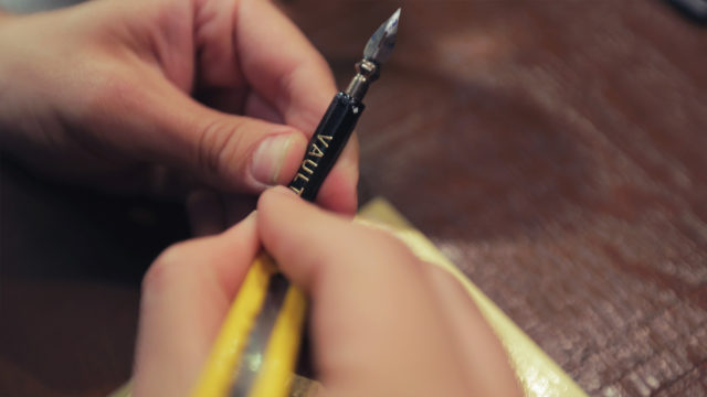
What strikes me most about From Form’s title sequence is not the ambition or the self assertion of these three designers –all recently graduated twenty-somethings– it is the sheer love that went into designing, building, dressing and finetuning the set. The attention to detail is incredible. The film reflects a nostalgic longing for a different time and a different place. From Form’s appreciation for old school ‘analogue’ craftsmanship has become a vital part of their creative process and has since come to define them as designers.
“The set was our playground at that time,
we could do whatever we wanted.”
the daunting task of making the titles
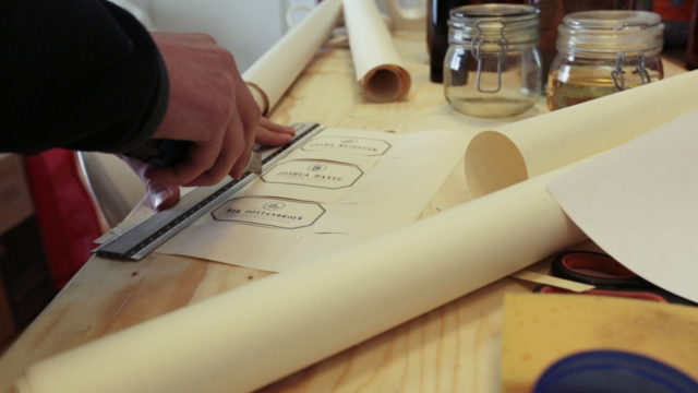
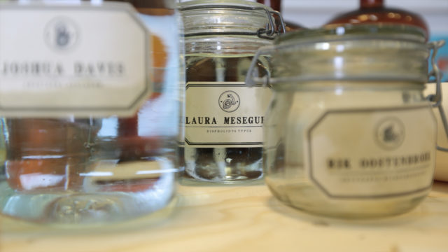
The main title features 46 names which were to be integrated in the scenes. A few names and effects were added in post.
Storyboarding
Building the set
Was it all worth it? The months of friggin’ hard work and no pay?
Jurjen, without reserve, replies “Yes, absolutely! It’s the best possible first job for a brand-new studio like From Form.” The carte blanche aspect of these kind of jobs is the best part, he says. “You’re responsible for every choice you make, on every level; aesthetic, story, or technical. And when, after many months of hard work, people from the audience and on vimeo and Facebook tell you how much they loved your film, that it moved them or even made them shed a tear, that makes it all worth it.”
And business-wise?
“Too early to say. We are still benefitting from the positive response we got on my graduation film A History of the Title Sequence (2011). We met a lot of nice people during OFFF, so who knows. Maybe something will come out of that.”
You can cross off “Make titles for OFFF” from your bucket list. And you did it in one year instead of the projected five. What’s next on the list?
“We are currently working on a small, but very nice title project. And we’d like to continue on the road we’re on now, as well as continue to develop the studio. We’d love to do a title sequence for a feature film. That would be quite the challenge. But let’s just aim at five years again for that one!”
A word of advice for young designers?
“We started the project on our own initiative. We’re a really small studio, it was just the three of us with the help of friends, zero budget, love for the project and wanting to make cool stuff. Go out there and start creating your own little world.”

Article and interview: Remco Vlaanderen, © Submarine Channel.
Published: 10 July 2013. Last update: 26 April 2019.
MUSIC AND SOUND DESIGN
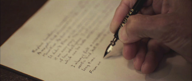
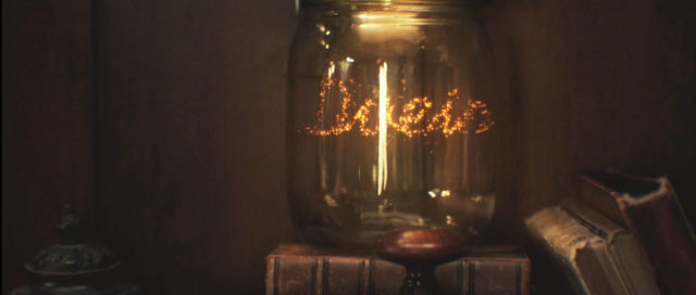
Joining the stage is Ben Lukas Boysen, aka Hecq, a composer and musician who runs his own sound design studio in Berlin. Hector asked him to step in and work on the project with From Form. Boysen used mostly acoustic instruments and sounds from random objects around the house for his score. He also did the foley sounds. “A lot of real things don’t sound so real,” explains Ben, using the sound of a pen writing on paper as an example. To compensate for the sensation of touch, he makes the sound bigger than it actually is. “Cardboard and a corkscrew had a really intense sound, which worked wonderfully with the pen and paper images.” The sound of 19th Century fireflies in a pharmacist’s jar? Ripping fabric and gently recording a light reflector; cut the low frequencies, and layer.

