BREEDER WINS APDG AWARD FOR ANALOGUE/DIGITAL BRISBANE TITLE SEQUENCE
Fellow nominees for the prestigious Australian Production Design Award in the Title Design category were the titles for ARIA 2012 and The Great Gatsby – both of those were made by bigger and more established companies. Creative director Joyce Ho let’s us know that Breeder is “crazy-humbled that our little studio ran with such company and won!”
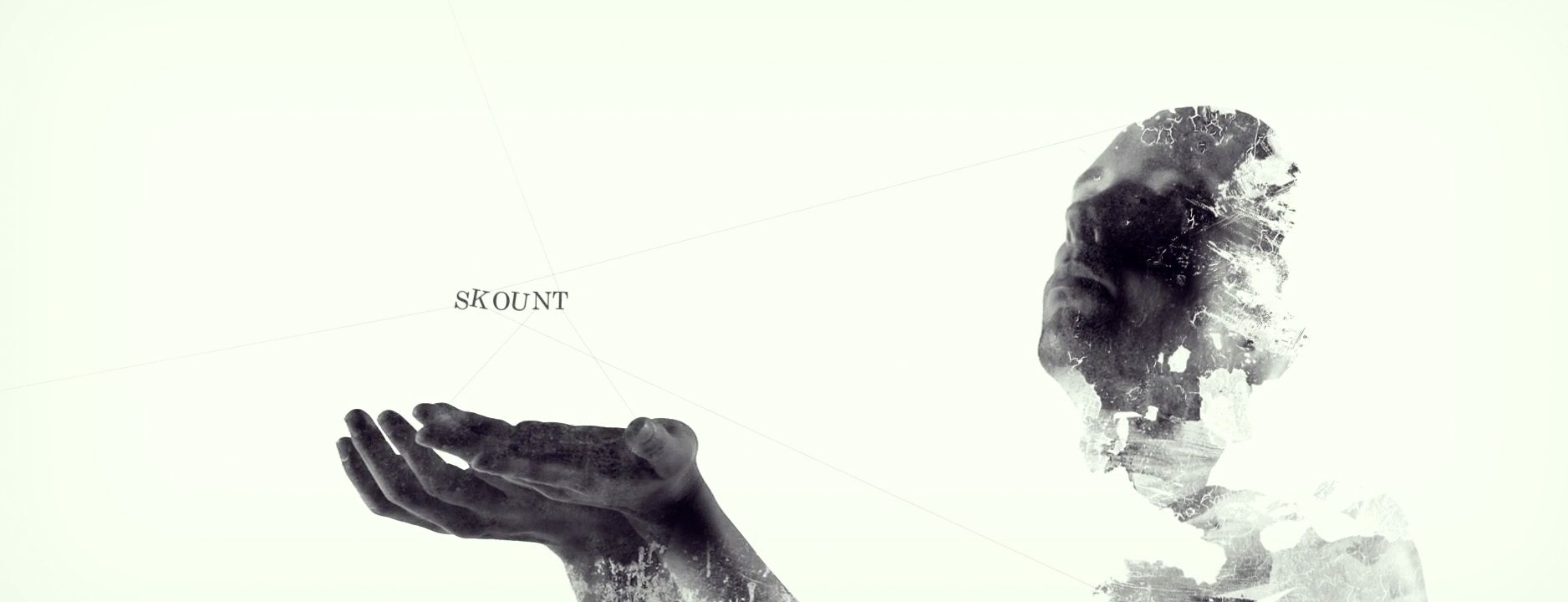
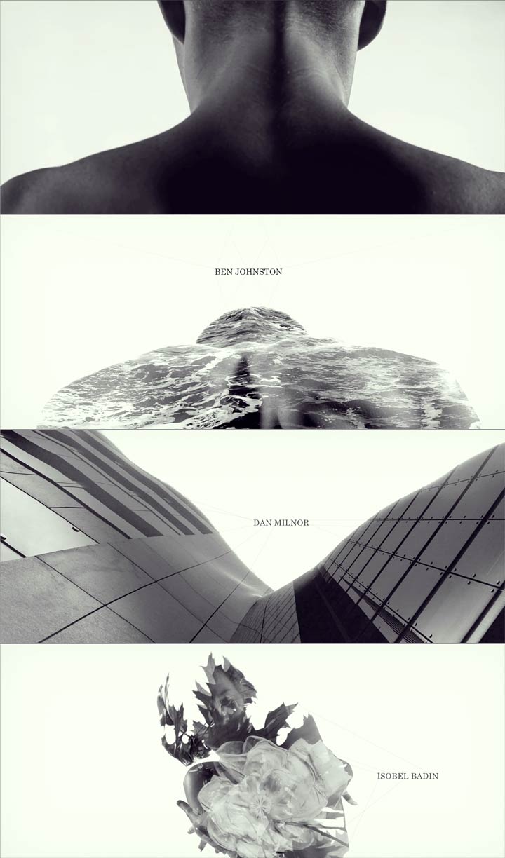
For the Brisbane edition of the Analogue/Digital creative conference, Breeder created a sensual journey with a refined and delicate aesthetic to honour the concept of “double exposure”. Glimpses of models stripped bare, their soft torsos and curves become moving canvases to host striking urban and natural textures, creating an emotive and intimate piece that ascends to an almost fantasia-like crescendo.
720-watchthetitles.jpg)
Known as Australia’s “tropical metropolis,” Brisbane creatives are producing work which is turning heads all over the world, and motion graphics locals, Breeder, are no exception. Invited to create the Opening Titles for the latest edition of ADBNE 2013, the studio jumped at the chance to contribute to the sell-out event again after creating opening titles for 2012. Held in May, the independently curated design event showcases up and comers and artists and had expanded to two days, moving from the Gold Coast to Brisbane, featuring 18 speakers from around the world.
We had a chat to Breeder’s Creative Lead, Joyce Ho, about the creative process behind the 2013 ADBNE Opening Titles and the creative scene in the tropical metropolis.
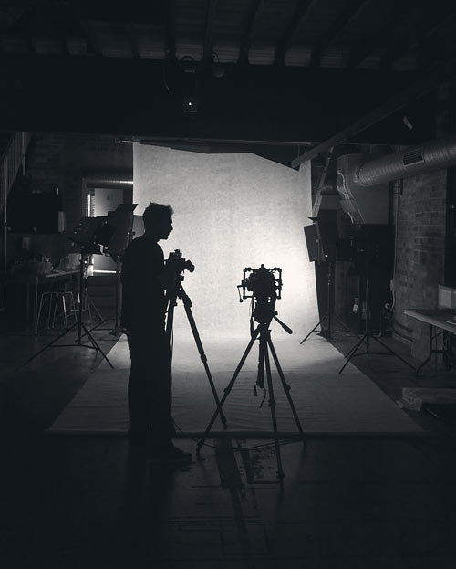
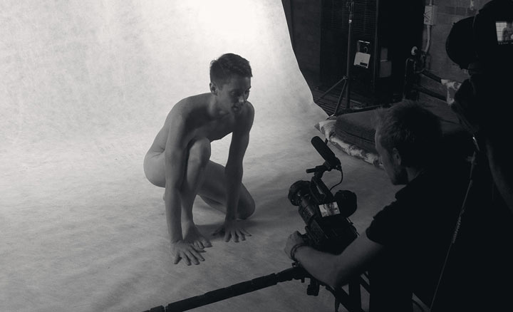
Setting up for the film shoot at the Breeder studio
Did you have a brief for these opening titles?
We didn’t get a brief – it was completely open, which made it all the more scary! The only condition we had was the soundtrack, which was already written and mastered so it had to be a certain length. From Alabaster’s track and the conference’s program design – where each page featured two presenter profiles that were overlayed on top of each other – we were inspired to run with the concept of double exposures in motion.
So how did you tackle making a concept like “Double Exposure” come to life?
Over the course of a month, we worked around the theme of binary, juxtaposing the urban sprawl and nature, black and white, flight and fall, and unification and disintegration.
Since we had the speakers and sponsor list, we first did a timing edit to figure out where to bring in the names. Using this, we storyboarded the narrative structure and made a shot list. We had a half day shoot with two dancers and then started designing a styleboard for each shot in the titles. We didn’t use any tracking markers on the dancers because while we did direct for the poses and movement we were after, we felt it was important to also let them do what they do best – dance.
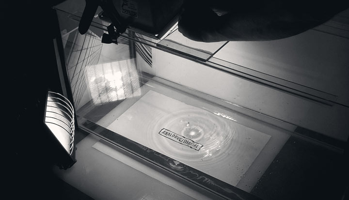
ADBNE 2013, Shooting the water scenes
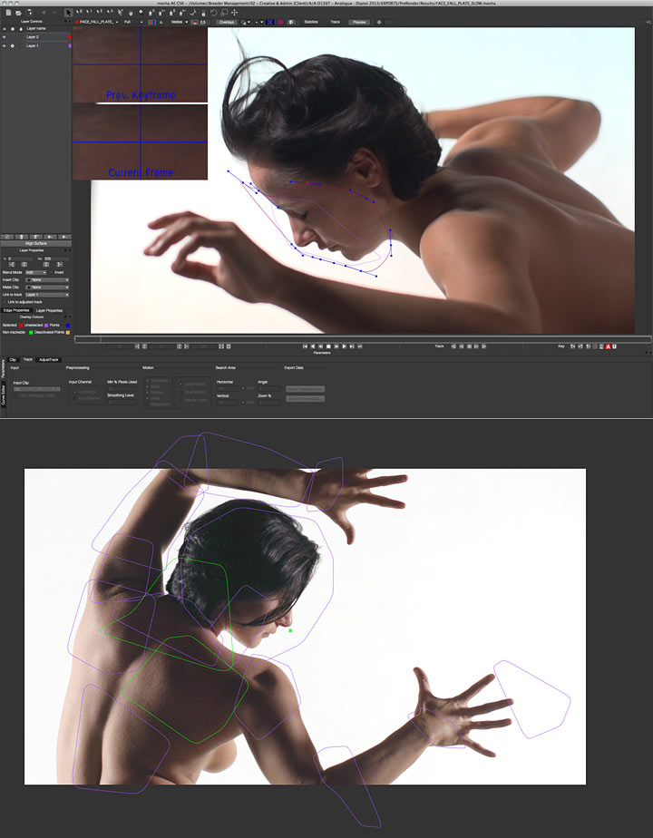
The programs we used were primarily Photoshop, After Effects and Mocha for tracking. We derived tracking points using expressions from the solid points we had and tweaked the movement using the Puppet Tool. The most time consuming parts were making sure each texture was tracked correctly. Finally the text and lines were animated and a final grade on top.
Did it all go to plan?
The original idea did work and the final result is not too far from the styleboards we originally conceptualised. The most challenging part of this project was the timeframe in which we had to complete. There were a handful of long nights to meet the tight deadline but we really believed in the concept so the team put in 110%. Overall, we are very happy with the titles! Considering how much time we had to complete them, I think it is one of the studio’s most ambitious and creative work yet.
Did anything specifically influence the aesthetic you were going for?
Double exposure is not a new concept but we wanted to put it in motion – drawing inspiration from many great photographers including Man Ray, Sarah Byrne, John Duenas and Dan Mountford.
ADBNE Opening Titles Breakdown
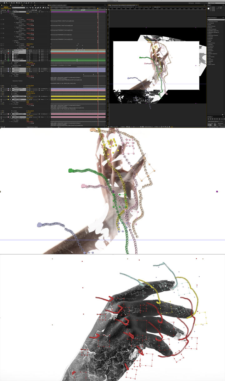
ADBNE Opening Titles in After Effects
Where does the soundtrack for this piece come from?
The soundtrack is an original from musician, Alabaster. He wrote the song specifically for the conference and was an amazing track to work with. It really helped us cement the kind of vibe and style we ended up going with.
What kind of response have these titles received?
The response has been overwhelmingly positive! It got an amazing reception at Analogue/Digital with a number of attendees stating it was one of the highlights of the conference. It’s also been blogged, tweeted, facebooked, received a number of views and likes, and even Staff Picked on Vimeo. We are absolutely thrilled and seriously humbled by the response.
Tell me a little about Breeder…
We’re a design led motion graphics studio with an all consuming passion for storytelling. We were founded in 2010 and we’re based in Brisbane, Australia. At Breeder, we believe things just look better when they move. Movement grabs your attention. It builds anticipation. And we think it’s a pretty perfect way to tell a story.
How does the creative process generally work at Breeder?
Our team divides the tasks fairly equally, in that we all do editing and animation. Everyone has a chance to put forward ideas when we first set out to define a concept and we collaborate together as a team to flesh it out. Whoever’s idea we run with gets to direct and see their vision through. My main role as Creative Lead is to direct the overall aesthetic of a project to make sure it looks the best it can.
What is the advertising/creative/design scene like in Brisbane?
Brisbane’s creative industry might be smaller than Sydney and Melbourne but it’s growing rapidly. From the rising number of art exhibitions and artist workshops to homegrown creative conferences, there’s been a definite increase in the cultural and creative side of things that has been really inspiring to see. Although it might be harder to get good work here, I think it’s because of this that we try a little harder.
Article: Rani Nugraha, © Submarine Channel 6 August 2013.
Year of production
2013
About Joyce Ho
As a kid, Joyce Ho always wanted to be in animation. When she completed a Fine Arts degree at Queensland Univeristy of Technology (majoring in animation), she scored a freelance position at Josephmark. When the creative house decided to create an offshoot bespoke motion studio, she landed the role of junior designer at Breeder. She is now Breeder’s Creative Lead.
Full credits
Created by Breeder, Creative Direction Joyce Ho, Producer Adam Sebastian West, Cinematography Chris Morris, Alex Gee, Adam Sebastian West, Editing Alex Gee, Design Lead Joyce Ho, Design Alex Gee, Timothy Lovett, Jai Mitchell, Compositing Chris Morris, Animation Alex Gee, Joyce Ho, Grayson Huddart, Starring Abagail Pirie, Anthony Trojman, Sound by ALABASTER.

