Title designer Richard Morrison says he wanted to pull the viewer into the movie before it even started: “The main idea was to make the sequence itchy and yet grand“.
This project reunites th1ng’s titles director Richard Morrison with Tim Burton for the first time since the seminal Batman sequence from 1989. Morrison worked closely with th1ng’s designer/director Shay Hamias. I talked to both designers about the making of the title sequence.
What was the concept for this title sequence?
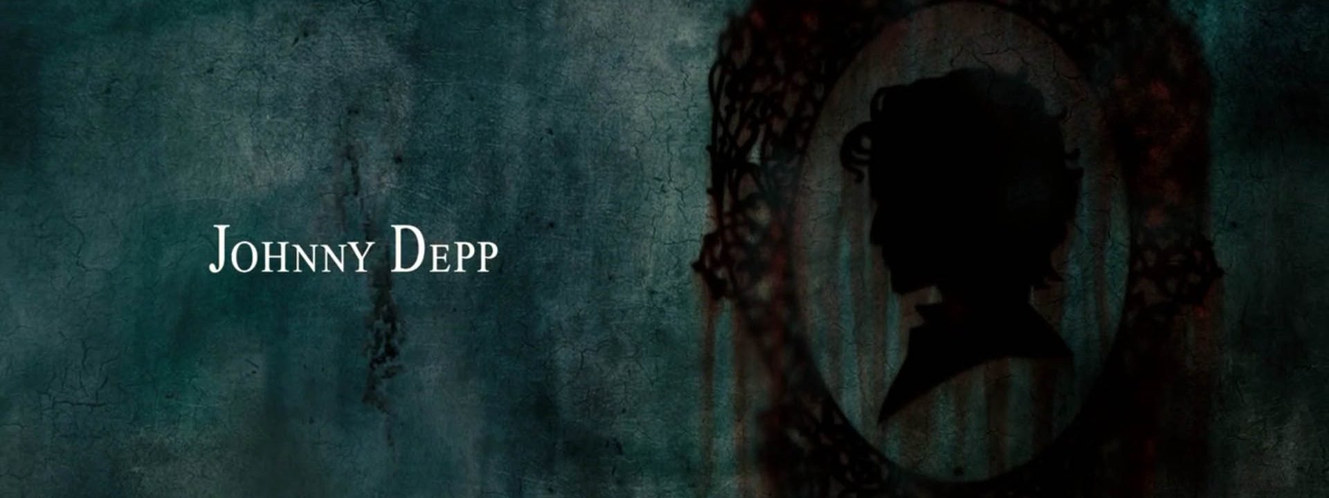
Richard Morrison: “The main concept was that of blood; A notorious theme of blood trickling down… through the darkness of Todd’s industrial London. A kind of visual journey of dread and eeriness with a reminiscent play of saturated colours and evocative images.”
How was Tim Burton involved in the creation of the title sequence?
Morrison: “It wasn’t anything straightforwardly agreed. That’s the beauty of working with Tim. We met for a few drinks, discussed the movie, watched some parts of it… and then he just let me come up with anything really. So I watched the movie and then I completely stopped thinking about it for a while, just to clear my mind, you know… And then, after some time, all of a sudden I started picturing the whole idea in my head. So I sketched a couple of slides, like a narrative, and then asked the team at th1ng, about 7 or 8 of them, to share our ideas. All of them great. Shay Hamias came up with this fantastic picture of an industrial Victorian London – as you would imagine it without having seen the film – and there you go that’s how it all started…”
Did you pitch your ideas?
Morrison: “We did not need to pitch a lot really. We took all of the creative work to Tim and he just spread them all over the floor… and then he spent about a day looking through them and said: ‘I really like this narrative piece’ (I did it in a literally black and white theme with pencils) – ‘and I really like those color frames’ (which were done by Shay) and there you have it.”
How long did it take you to produce it?
Morrison: “The making of Sweeney Todd took about three months. We had at times about eight people involved and to be honest it was a very intensive project. There was a big team of CGI and then compositing etc. The biggest challenge was definitely to put the whole idea into existence. We did everything in house at th1ng, including production.”
I asked Shamias to define his role in the production process.
Hamias: “My role was to direct the design aspect and the whole animation process. First, I started off creating the look for approval by Tim Burton, and then we took it to the 3D modelers, both actual ones and in CGI. I was then referencing for the film shoot, stills, Photoshop painting etc. and basically was making sure that everyone in the team kept the same style across all the mediums. So all in all, I was directing the animation, timing and movement, and then at the final stage I was putting all the elements together in compositing with my team.”
What was the biggest challenge to overcome?
Hamias: Definitely, the biggest challenge was to do the blood movement. We had to learn how to “control” it and did a lot of filming on that…but patience is a virtue… and finally we got it in the end.”
Morrison: “We had to build special platforms within which we imitated blood movement and filmed it”.
Hamias: “Coming up with the idea was difficult enough already, but then we thought: How on earth are we going to do it? So using technology was a very crucial element and probably one of the most important aspects. Yet, we did it all in house, so are very pleased with it.”
PR Executive of th1ng, Rafal Kwiatkowski, eloquently describes the title sequence in the press release:
“The sequence opens up with a gloomy picture of 19th century London. It is foggy, dark and engulfed in the monotony of falling rain. The big red drops splash thickly onto rooftops and rub into a sooty, industrial landscape. The camera tracks slowly along a panoramic sight of London as the viewer is led to Sweeney Todd’s Fleet Street garret room.
A glimpse through the window sees Sweeney’s iconic barber’s chair and this begins Morrison’s juxtaposition of the movie’s key visual elements with their symbolic meanings.
An image of traveling blood becomes the central theme to the sequence and the viewer is invited to follow its course. The blood dribbles down to spatter machinery, pool in gutters and flows into the sewer tunnels. At one point, it trickles down the chair to the floor and in a melancholic snaking movement seeps through the floorboard’s cracks into the drain before rushing out to the sea. The image of Mrs Lovett’s baking mince pies then takes over to become the sequence’s grand finale.”
The Sweeney Todd title sequence was nominated for Best Film and TV Graphics by the British Animation Awards (BAA) in 2008.
Year of production
2007
About Richard Morrison
Richard Morrison is one of Europe’s most prolific and accomplished title designers whose carreer spans over four decades. Morrison started his professional carreer working at a production studio where he ran into Maurice Binder. He assisted Binder with the production of the main title sequence of one of the Bond movies, which led him to pursue movie title design. He got his first “lucky break” in 1979, when director Franc Roddam asked him to design the main title for Quadrophenia.
Full credits
Director (film)
Tim Burton
Designer
Richard Morrisson, th1ng
Designer/director
Shay Hamias, th1ng
Executive producer (titles)
Dominic Buttimore, th1ng
Production companies (film)
DreamWorks Pictures and Warner Bros Pictures

