Instead of going for a slick, “3D heavy” title sequence for X-Men: First Class – like the titles for the previous movies in the franchise – director Matthew Vaughn made it perfectly clear in his brief to Prologue‘s executive producer Kyle Cooper that he didn’t want to go down that route, and he sticked to that. Out of all the various concepts made by different designers at Prologue, Vaughn selected four designs to elaborate on and finally settled on the cleanest, simplest design of them all – a Maurice Binder-inspired board which was made by Simon Clowes.
.jpg)
One thing that Simon Clowes picked up from the brief was that the director loved the early James Bond titles. “He wanted the title sequence to feel like it was set in the same time period as the movie,” says Clowes. Then it is no coincidence that the titles for X-Men: First Class echo Maurice Binder‘s iconic Main Title for Dr. No – 007’s cinematic debut. In fact, “First Class” is set in 1962, the same year that Dr. No was released. Almost 50 years later, Binder’s Main Title hasn’t lost any of its appeal or its relevance. Not in the least because new generations of motion designers continue to reference his crisp no-nonsense typographic compositions and his playful abstract motion graphics.
.jpg)
X-Men: First Class, storyboard (scene)
Simon Clowes – still in his twenties – adds that Saul Bass was another influence for his X-Men titles. According to Clowes, designers and animators today still appreciate the classic title designs by Bass and Binder for their sophistication, simplicity, and hand-made optical feel. “There were a lot of limitations back then compared to today where we have easier ways to animate graphics and anyone can move type and objects around on a screen. In my opinion, these limitations often led to more interesting and controlled results where a strong concept led the design and tricks were kept to a minimum.” Which is why Clowes kept the design as clean as possible. “We didn’t use any tricks with the typography in his sequence.“
This approach obviously suited Vaughn, who wanted the titles to be imbued with a sense authenticity. “He emphasized the fact that it should feel like it was made in the 1960s and not like it was made now, trying to feel retro. I don’t know if we succeeded or failed in this request, since we didn’t have the time or resources to do it hand made and optically,” ponders Clowes.
MOTION TESTS
Alternative 3-D motion test (no sound)
As you can see from the 3-D motion test above and from the original board art, Clowes got rid of the redundant textures and imperfections. “We were trying too hard to make it feel old and grungy. We removed these effects because it would have been clean in the 1960s.”
“I collaborated with Alasdair Wilson, an extremely talented animator who I also had the pleasure of working with on the Sherlock Holmes Main on End titles. We had a very short amount of time to do these tests, but I felt the execution was clear and what I had in mind.”
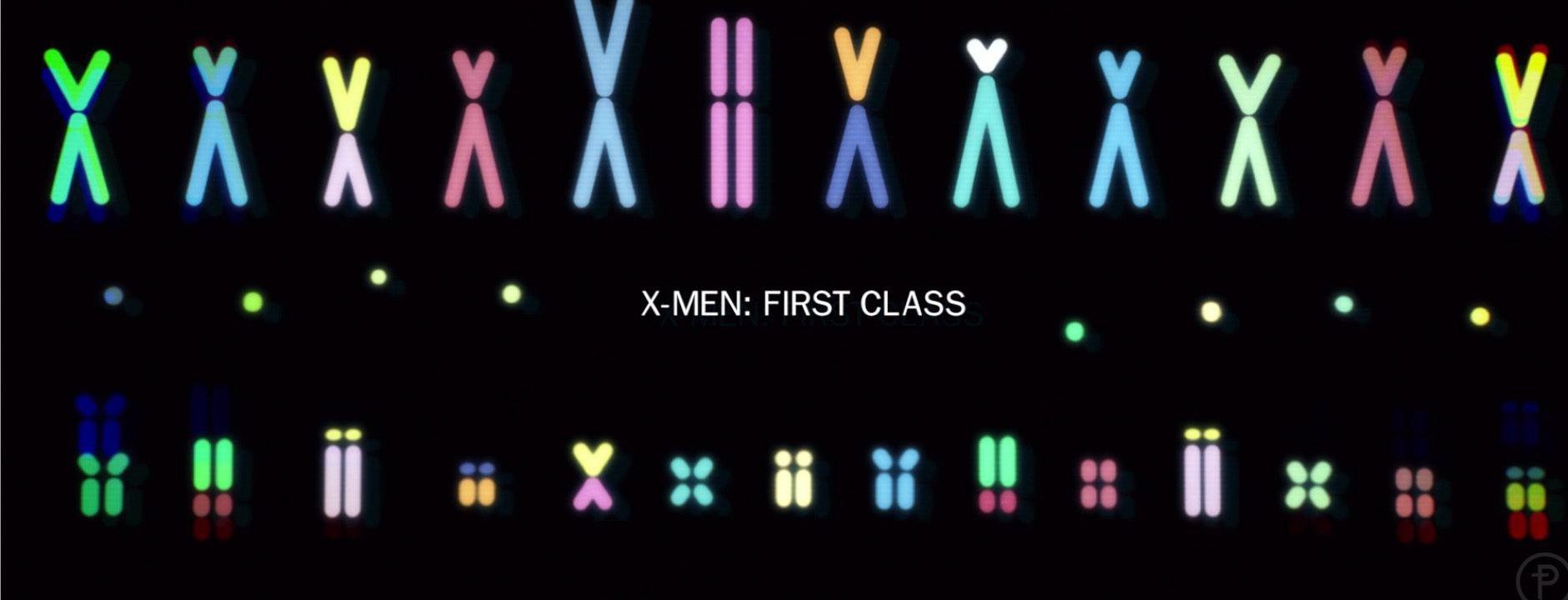
The challenge Clowes set for himself was to see in how many different ways he could graphically represent the scientific methods and technologies and the cellular processes associated with gene technology and mutation. “I researched everything from DNA printing and genetic coding, and from mitosis and meiosis to amino acid formations. Everything looked very scientific in nature and not very interesting, so I began deconstructing the shapes, changing the colors and redrawing them in Adobe Illustrator. I placed a lot of restrictions on the design regarding colors and shapes and the typography.
After the research and development, I teamed up with Ash Thorp and Ji Yun Ha who helped me flush out the sequence. ”
.jpg)
X-Men: First Class (still)
For those not familiar with the mythology of Marvel’s X-Men: It is a mutant gene, the so-called X-gene that lies at the very core of the formidable powers of the X-Men and Clowes’ Main on End title graphically represents that. Clowes and his team at Prologue created a made-to-measure, elegant, and stylish title sequence that fits the epic origins story of this X-Men movie like a bespoke Savile Row suit.
.jpg)
X-Men:First Class, title sequence, deleted scene.
The music that was used is a temp soundtrack by Boards of Canada called “Chinook,” as Prologue never got the final score from Fox. “We were later provided a click track but it was more interesting to use music,” comments Clowes. The final score used in the movie was composed by Henry Jackman.
Awards
Special Jury Recognition, SXSW Excellence in Title Design Awards 2012. Read more.
Winner of a Silver Art Directors Club Award 2012 in the Motion category.
Article: Remco Vlaanderen, © Submarine Channel, 14 November 2011. Last update: 10 May 2012.
Year of production
2011
About Simon Clowes
Simon Clowes (1982) is originally from the UK. After completing a Bachelor of Art Honors degree in Graphic Media Design from the London College of Communication, he worked at the BBC Broadcast for a few weeks, before moving to Los Angeles to work at Prologue Films. “I was introduced to Kyle’s work at university,” Simon recalls, “Just before I graduated I sent him my student portfolio. I then joined Prologue late August 2005.” Clowes personal design heroes? He really likes the work of Josef Muller Brockmann, Armin Hoffman and Wim Crouwel.
Full credits
Design Director
Simon Clowes
Executive Producer
Kyle Cooper
Producer
Unjoo Lee Byars
Production studio
Prologue
Animator
Alasdair J.T Wilson
Designers
Ash Thorp , Ji Yun Ha
Film Director
Matthew Vaughn







What puzzles me is that the designer gave the sequence the look of a RGB tv screen, we see the lines & dots. Why would he do that if he explanes that his main influence is someone who designed mainly for film? It does have a 60’s feel to it, but to me it looks like a reference to early scientific computervisualisations in the sixties, that makes more sense in regards to the X-men saga than a Saul Bass reference, I would think. Anyway I’ll check out the Saul Bass book, thanks
Love these titles, but what’s the song playing? It goes with them really well!
It’s actually temp music. A track by Boards of Canada called Chinook.
This is really cool!
Don’t care for X-men, but I love this sequence. It remindes me more of early electronic tv experiments with radar and magnets than Saul Bass, who would have obviously worked with film for his filmtitle sequences, no?
I don’t know what electronic experiments you are referring to exactly (you are the expert on tv graphics -if you are who I think you are), but those visuals sound fascinating. Bass created titles for film, but he did a lot of other stuff as well. Maybe for TV. The new Bass monograph will have the answers.
badass work Alasdair!!
just because someone regards saul bass as an influence for shape and form doesn’t mean that they can’t add a slightly different twist to the recipe. savor different flavors i say!
and awesome work Ash, Simon, Aladair, and Ji!