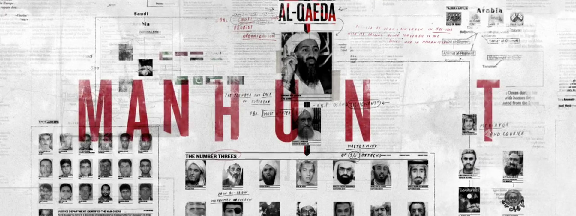
A DETAILED ANALYSES OF THE MAKING OF THE TYPOGRAPHIC MAIN TITLE FOR MANHUNT
Introducing Manija Emran, typographer. Ever since we first saw the process for the end credit sequence for Rango, Manija’s beautiful hand-drawn Western-style typography struck a massive chord here at Watch the Titles. Formerly at Prologue, where Manija created memorable typography for films such as Robin Hood, Breaking Dawn and Fright Night. Now a Creative Director at The Mill+, Manija developed an intricate typographic Main Title concept for the HBO doc Manhunt that perfectly reflects the long and painstaking process of capturing the world’s most wanted man. We think it’s her best work yet. With her family’s roots in the Middle East, Manija knew that this project was going to be special, and very personal.
720.jpg)
Manhunt on Manija Emran’s Vimeo
Raw data is not designed. The CIA analysts who tracked down Osama Bin Laden navigated thousands of spreadsheets and documents filled with words, numbers, and coordinates, to which they added countless scribbled notes. “It only seemed fitting to also show the titles from the perspective of the analysts who hunted Bin Laden, as this was what he was making the film about, says Manija, “Not the bombastic military assault, but the intricate piece by piece journey.”
The designer embarked on a research mission of her own, gathering real facts and amassing files on the subject – never just filler. “I became really paranoid that when I was flying I would get stopped with my bag and computer filled with Bin Laden info and research! Tricky to explain, “no officer it’s for a title sequence.”
Manhunt tells the story of the two-decade search for Bin Laden, who had been on the CIA’s radar since the early 1990s. Manija Emran was working in London at the time of the 9/11 attacks and remembers that day very well. “I was deep into a project when a colleague rushed over to tell me that I needed to drop everything and see what was on screen. I didn’t quite fully comprehend the scale of what had just been broadcast; it all seemed so unreal. But with a sister in New York, whom I immediately worried about, a friend in the military and all of us from Afghanistan, it very quickly dawned on me that this was going to effect us.
“I walked home, which for me at the time was a hostel, to a crowded living room packed with Americans re-watching the scene over and over again. This, I didn’t quite understand. Over the next few days I found myself in arguments with a couple of the kids that were a little hasty in pointing the finger to blame. And blame they did, but somehow all muslims and I happened to be one of them. I was on the defense for a while. I very much understood their anger and frustration, as I shared it, but to blame all who were muslim was… well extreme.”
RV: What did it mean to you, personally, to work on this documentary?
“I am very sad that I can’t visit the country of my birth because of the wars. Having seen the Taliban change the history of the country was very painful, and knowing that Bin Laden was harbored there also added to the grief. So working on the project was very personal. I found out things I never knew and it certainly helped me understand the psyche of the hunt and the evolution of the country in which I was born and which was once home to my parents.”
Manhunt Main Title Pitch I “Collaged Timeline” on Vimeo:
“I wanted the look to be detailed and personal, but also obsessive so to show the amount of dedication and intimacy these analysts had to their task. This obsession was shown via the sheer amount of unrelated information, scribbled notes, taped on pics, but also later via the animation.”
“We felt it to be important to have the information gradually reveal on, in layers and accentuate the intricacies of the design. Catching only bits of info, offsetting them, so that one would almost have to stop the frame in order to fully read all the content. This to me was representative of what the analysts would be faced with, an alarming amount of info, some minute that later could become major.”
Manhunt title sequence, Pitch 2 “Redacted to Highlighted” on Vimeo:
RESEARCH
“I wanted to try to understand the hunt, so I took an analytic approach. I studied heavily beforehand, and I did a lot of reading. Obviously the principle book was ‘Manhunt’ by Peter Bergen. The real CIA documents from the client were most interesting.
“I also studied the characters, from the CIA agents to the terrorists, taking detailed notes. I became really paranoid that when I was flying I would get stopped with my bag and computer filled with Bin Laden info and research! Tricky to explain, “no officer it’s for a title sequence.”
Manhunt title sequence, Process: Notebooks on Vimeo:
“These research notes I then used for the handwritten elements in the title and throughout the many graphic scenes in the doc, adding a handcrafted feel. They were scribbles, notes added on top of the printed word. It was almost a scrapbook like approach. So that if you pause the titles and read any bit of text, ALL of it is relevant and deliberately factually correct. Hunting someone like Bin Laden is not about the high tech, it is all about the printed words and the hand written notes.”
Manhunt, stills from the graphical sequences on Vimeo:
“The director and editor Joe Bini wanted to incorporate a sort of Al-Qaeda chart in the title reveal. So we pieced together that final Al-Qaeda chart you see at the end of the film. The tricky thing was that (…) it couldn’t simply be graphic fluff, it had to be a functioning chart that could actually be used or understood by the agents themselves.”
One of the highlights for you was meeting the real CIA agents who helped track down Bin Laden, and spending an evening with them after the Sundance premiere. What did they think of your design work?
“The design had actually mirrored their frustration at finding information but not understanding it, struggling to piece together the clues, which is something I definitely wanted to express in the fractured nature of the design. They spoke about how it was made harder for them to hunt for Bin Laden because information was not designed, they had to hunt for him navigating the information using Microsoft Excel!”


Regarding the logo, why did you chose to create more space between the letters that make up the ‘hunt’ part of Manhunt?
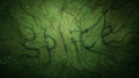
“I wanted the logo to visually represent the hunt, and so the letters after ‘man’ start running off, as if in a chase, or a hunting. The fractured chase, frustrating and non conventional.”
The crawling arrow illustrates the connections between terrorists and then points to Bin Laden whose eyes are covered by tape. Quite a dramatic visual statement.
“Covering his eyes could represent him no longer being the target of the hunt. He had been hunted. Killed. Found. And so covering his eyes, could simultaneously mean he was no longer on the chart, crossed out.”
.jpg)
Manhunt title sequence, Al-Quada chart
 (detail)
The Mill+ delivered more than ten minutes of animation; the main title, and graphical moments. This in a fast turn around of three weeks and done by a very small team of 10 people.
Article: Remco Vlaanderen, © Submarine Channel 17 June 2013. Last update: 21 June 2013
Year of production
2013
About Manija Emran

Manija Emran first became interested in typography in school, via one of her type teachers. After her studies and some work experience in Montreal, Manija combined her love of adventure with that of her work. She lived in a number of cities, working with the designers she admired.
Full credits
Studio The Mill+ Designer/creative director Manija Emran, Executive producer Stephen Venning, Post-Production/VFX The Mill LA VFX Producers Adam Reeb, Lusia Boryczko Animators Justin Sucara, Victor Duncan, Andrew Marks, Junior animator Kyle Moore, Coordinator Krissy Estrada.
Manhunt Director Greg Barker, Agency HBO Documentary Films, Production Company A Passion Pictures & Motto Pictures Production Music Black Snowflakes by Max de Wardener.

