AGI OPEN TITLES REPRESENT THE “MESSY” CREATIVE PROCES
“Some frames are ugly on purpose”
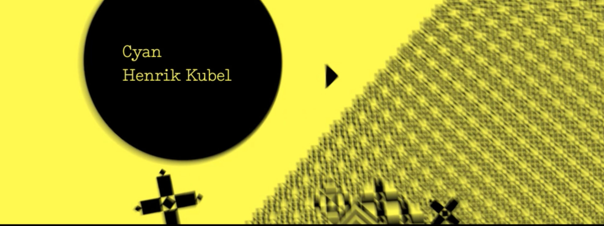
In the vein of ancillary sequences for events like Physalia‘s exquisite Mad MMX artist line-up, and the AICP sponsor reel, this strong, punchy animation introduces the headliners for Porto’s 2010 Alliance Graphique Internationale conference.
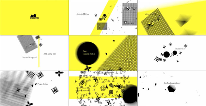
With echoes of the fractal drumfire in creator Filipe Carvalho’s TEDxEdges earlier event titles, this piece was created in collaboration with Porto local graphic design studio This is Pacifica.
A process described by Carvalho as “a humbling experience”, this abstract, miniature masterpiece opens with an impossible-to-ignore audio distortion which calls our immediate attention. We asked Carvalho a few questions about just how the magic happened…
On your Vimeo page, the animation is described as a visualization of “the process being the project.” Can you elaborate on that?
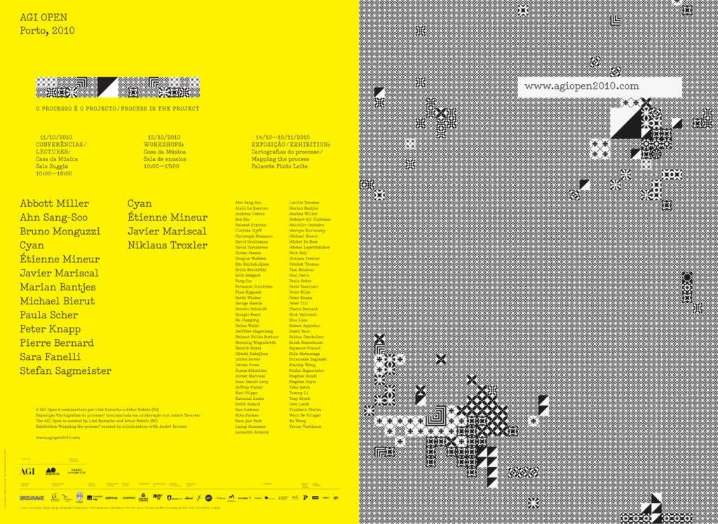
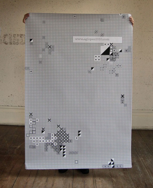
Carvalho: “For the first AGI conference open to the public, their theme was to talk about the AGI members’ creative process and show how they think and approach their work. The process was indeed the project. For the opening titles, we (myself and This is Pacifica) tried to stay close to the event image created by AGI member R2.”
Why did you describe the creation of this sequence as a “humbling experience”?
“The Alliance Graphique Internationale stands for excellence in graphic design, and it’s members are of great influence to me,” says Carvalho. “The work they do sets the bar for everything, and people like Michael Bierut, Paula Scher or Marian Bantjes need no introduction. So naturally I was very humbled to be working with them, and also trying not to screw up!”
You mentioned that this abstract, strongly graphic approach was a new experience for you. Why did you decide on this particular approach for AGI?
“Well, I proposed an alternate version at first, more loosely based on R2‘s work, but ultimately we agreed that we should stay in the realm of simple geometry and abstract shapes. The creative process is a non-linear sequence of objective approaches, mistakes, happy accidents, frustration and happiness. Moments of speeding up and slowing down. Sometimes it’s a mess and sometimes it’s very focused. So the titles try to mimic those moments, allowing for the accidents, the mess, the speed changes, and the overall feeling of a storm of feelings and solutions. It was a new experience for me because I usually just show the calm, serene end of that spectrum – not the whole messy process. But it was very refreshing. Some frames are ugly on purpose, and that was different for me.”
How important is the audio element in this animation?
“It was very important. It had to be a noisy soundtrack, but with melody inside of it. And it should also provide some pacing and some moments for editing, which it did. It was the only track I was confident would work. The wrong choice of music and the whole thing would feel wrong.”
Text: Lotje Sodderland, © Submarine Channel 2011
Last edit: 21 May 2019
Year of production
2010
About Filipe Carvalho
Filipe Carvalho is a freelance designer and director for film and tv. He lives and works in Lisbon, Portugal. He was web designer and graphic designer for seven years, but moved on to motion design, because he got frustrated with the limitations of web and print. “There I was able to stretch my legs in graphic concepts, narrative and filmmaking,” Carvalho says.
Full credits
Graphic design
R2
Motion Design
This is Pacifica/Filipe Carvalho
Music
The North Valley Subconscious Orchestra

