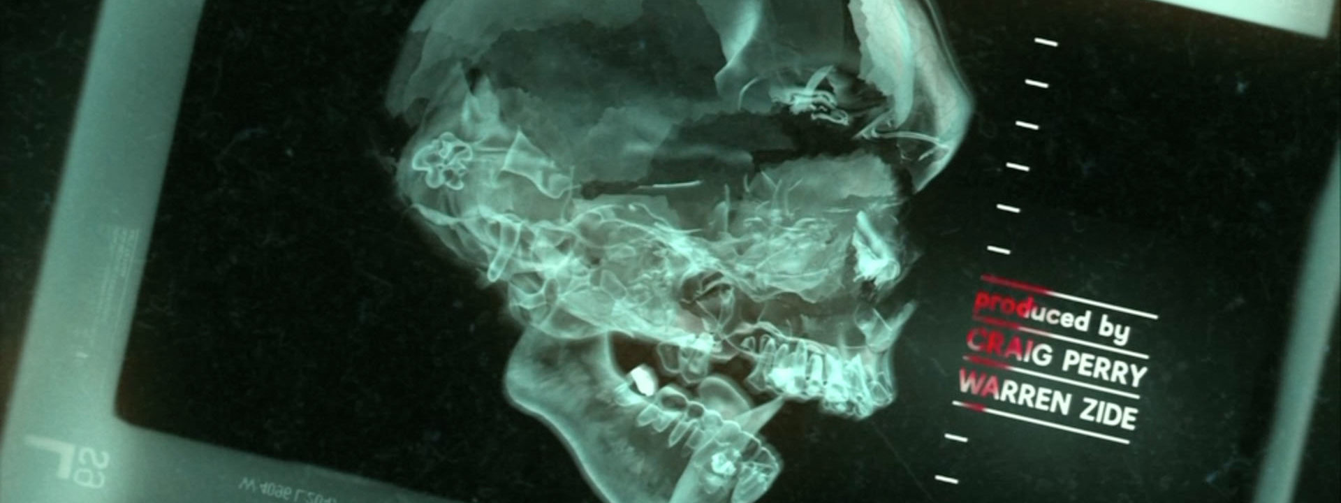
PIC’s opening title sequence for The Final Destination is the perfect introduction to the fourth instalment of the successful horror movie series. The Hollywood “design boutique” aimed for maximum impact and effect. The best way to see this would be in a movie theater in 3D. We’re showing the 2D version of the titles.
720.jpg)
We discussed the ‘Making Of’ in an email interview with PIC’s founders, art director Jarik van Sluijs and executive producer Pamela Green.
You can’t fool Death. Or at least not in The Final Destination – a horror movie series about a guy who has visions of himself and his friends dying in horrific ways. But all the precognitive powers in the world can’t prevent each and every one of the main characters –all teens, of course– from meeting their final fate. The main appeal of the movies is the grizzly and gruesome, but very creative death scenario’s of the characters.

(The Final Destination, stills)
How did PIC get involved in this project?
PIC: “Initially, when the filmmakers approached us, their main concern were the visions within the movie. Before every death, the main character in the film has a dream or vision of a series of images hinting towards the way the next victim will die. In their minds the rough cut of the movie they had at the time did not have enough 3D moments in them, and they decided that the visions as well as the titles would be the best places to remedy this.
“At that point we all thought that there would be a visual unity between the titles and the visions, and we designed boards with that in mind, but eventually our X-ray concept overshadowed that idea.”


What was the concept behind the sequence?
PIC: “The client’s brief was to create a sequence for the fanboys that used the equity that existed in the deaths of the first three movies within the franchise. For legal reasons we were not allowed to show any of the actors in the previous films, so we almost couldn’t use any of the actual footage from those films. The problem was therefore how to show those very specific deaths without any of the footage. The truth is, even if we were able to use that footage, none of it was shot 3D.
“The X-ray idea took care of that problem, and conceptually it seemed authentic to the spirit of these movies, to show deaths in new and innovative ways. We then intercut the X-rays with footage from the previous films that did not show any actors, and with footage we shot of our own actors, in exactly the same death scenes.
“Finally, the whole sequence has a stereoscopic dirt pass, with specks both in and outside of the screen. It also has a grain pass that sits slightly inside of the screen to avoid engaging the screen plane in any way, and so creating a real window to a stereoscopic world.”
The X-rays look very realistic. How did you composit this sequence?
PIC: “None of the X-rays are real. We created a shader in our 3D software, and combined that with some processing in our compositing software, to create the exact X-ray look. We then added different layers of textures and atmosphere to complete the look.
“The footage within the sequence of the explosions and the final death of the man falling out of the roller coaster came from the previous movies. All the other footage was shot in-house, mimicking shots we couldn’t use from the rest of the franchise. All the footage was composited to get the most out of the stereoscopic effect. Even though they were flat 2D elements, we masked out pieces and changed their convergence to create a stereoscopic image. This is evident in shots like the hand reaching for the knife.”
You didn’t design the Final Destination logo. What inspired the typography for the credits?
PIC: “The filmmakers asked us to incorporate the logotype used in the marketing of the film, so we used the same typeface, but sliced it up into pieces to make way for the rest of the credits. Those were inspired by the type and markings on actual X-rays. We used slight rotations on some, alluding to the way a doctor might roughly place them on a light table. We then introduced a little color, in the form of red blood seeping into the titles, and explosions.”
PIC also designed the “visions” sequences in the movie. The use of CGI and visual effects in movies is increasing. Are there more opportunities now for title designers to get involved in other aspects of movie-making?
PIC: “The tools used by visual effects houses and us are very similar, and in some cases the software is identical, so the possibilities to enter into the visual effects realm is great, but we tend not to pursue any purely visual effects oriented work. All the visual effects work we’ve done for movies such as Final Destination, Twilight, and Hancock, have all been stylized storytelling sequences. They are born out of visual design and storytelling, and although they involve CGI, are not purely visual effects jobs. We also shoot plates and other elements ourselves, for many of our sequences.”
Storyboard art


Text and interview: Remco Vlaanderen, © SubmarineChannel. 2 Sep 2010. Last update: 3 Aug 2011.
Year of production
2009
About PIC
PIC is a “design boutique” located in Santa Monica, CA. The company was founded in 2005 by Pamela Green and Jarik Van Sluijs.
Full credits
Lead designers
Pamela Green, Jarik Van Sluijs, Stephan Burle.
Additional credits
Gary Hebert, Andrew Hoeveler, Garrett Knisley, Robin Roepstorff, Hai Ho, Clint Chang,
Greg Reynard, Phillip Shtol, Bao-Uy, Luu, Ben Bullock, Gonzalo Amat, Jon Salmon, Luis Martos, David Hwang, Paul Makowski, Mike Anders
Film director
David R. Ellis


Great work and fabulous graphics , what kind of qualification would I require to work in this field . I live in Ireland . Your advice and comments would be much appreciated.
Cheers
Harry